A New Coefficient of Correlation
https://towardsdatascience.com/a-new-coefficient-of-correlation-64ae4f260310
What if you were told there exists a new way to measure the relationship between two variables just like correlation except possibly better. More specifically, in 2020 a paper was published titled A New Coefficient of Correlation[1] introducing a new measure which equals 0 if and only if the two variables are independent, 1 if and only if one variable is a function of the other, and lastly has some nice theoretical properties allowing for hypothesis testing while practically making no assumptions about the data. Before we get into it, let us talk briefly about how more traditional correlation measures work.
Correlation Refresher
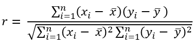
There are few tools that exist to help understand data that are more commonly used (and misused) than the popular correlation coefficient. Formally known as Pearson’s
As a final reminder, this value can range from -1 to +1 with negative values implying an inverse linear relationship between the two variables being measured and a positive one implying the opposite. Notice the emphasis so far being placed on measuring linear relationships. Linear relationships can be understood as the shape of a relationship being somewhat traceable using a straight line.
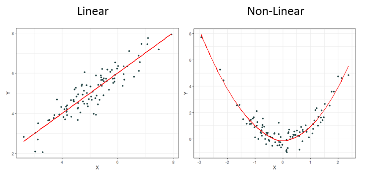
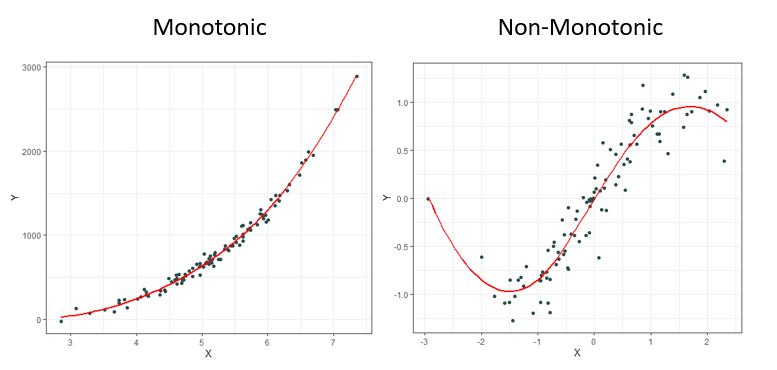
It should come as no surprise to most that it is rare to observe linear relationships in the real world. This is why other measures have been created over the decades such as Spearman’s ρ (rho) and Kendall’s τ (tau) to name a few. These newer measures are much better at identifying monotonic relationships and not just linear ones which makes them more robust since linear relationships are a specific type of monotonic relationship. Monotonic relationships can basically be understood as either always increasing or always decreasing.
Most of the time correlation is used, it is used to try and identify not necessarily a linear or monotonic relationship between two variables of interest, but instead identify if there exists relationship. This creates problems, for if relationships are neither linear nor monotonic, these current measures do not work very well. Note how the plots below all display clearly strong relationships between two variables, but commonly used correlation techniques are only good at identifying monotonic ones.
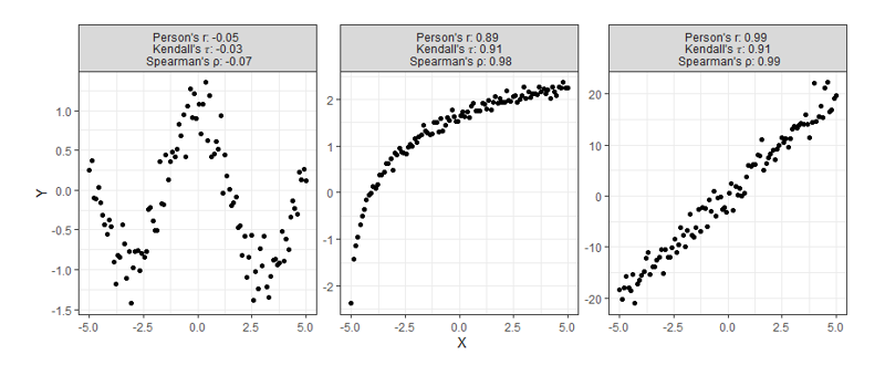
Despite having obvious shortcomings, these correlations are still being used to make many conclusions about all sorts of data. Is there any hope for identifying relationships that are even more complex than the ones shown above? Enter, the new coefficient
One last note before moving on, a paper was published in 2022 titled Myths About Linear and Monotonic Associations[2] related to the issue of stating which popular measure of correlation is preferred for which type of data. Earlier, I suggested that Pearson’s
The Formula(s)
Before introducing the formula, it is important to go over some needed prep-work. As we said earlier, correlation can be thought of as a way of measuring the relationship between two variables. Say we’re measuring the current correlation between
Sticking with the same train of thought, suppose we still wanted to measure how much
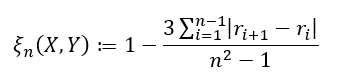
There are two formulas used depending on the type of data you are working with. If ties in your data are impossible (or extremely unlikely), we have
and if ties are allowed, we have
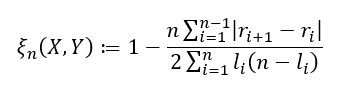
where
To not dive too much deeper into theory, it is also worth briefly pointing out this new correlation comes with some nice asymptotic theory behind it that makes it very easy to perform hypothesis testing without making any assumptions about the underlying distributions. This is because this method depends on the rank of the data, and not the values themselves making it a nonparametric statistic. If it is true that
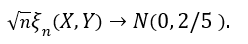
What this means is that if you have a large enough sample size, then this correlation statistic approximately follows a normal distribution. This can be useful if you’d like to test the degree of independence between the two variables you are testing.
Code
Along with the publishing of this new method, the R package XICOR was released containing a few relevant functions including one called xicor() which easily calculates the statistic
I’ll note that these three functions are written very simply and for introductory purposes. With that said, for any professional use I’d encourage more efficient functions produced from professional libraries or more efficient contributors. For example, here is a python function written by Itamar Faran that works much faster then the one provided below.
## R Function ##
xicor <- function(X, Y, ties = TRUE){
  n <- length(X)
  r <- rank(Y[order(X)], ties.method = "random")
  set.seed(42)
  if(ties){
    l <- rank(Y[order(X)], ties.method = "max")
    return( 1 - n*sum( abs(r[-1] - r[-n]) ) / (2*sum(l*(n - l))) )
  } else {
    return( 1 - 3 * sum( abs(r[-1] - r[-n]) ) / (n^2 - 1) )
  }
}

## Python Function ##
from numpy import array, random, arange

def xicor(X, Y, ties=True):
    random.seed(42)
    n = len(X)
    order = array([i[0] for i in sorted(enumerate(X), key=lambda x: x[1])])
    if ties:
        l = array([sum(y >= Y[order]) for y in Y[order]])
        r = l.copy()
        for j in range(n):
            if sum([r[j] == r[i] for i in range(n)]) > 1:
                tie_index = array([r[j] == r[i] for i in range(n)])
                r[tie_index] = random.choice(r[tie_index] - arange(0, sum([r[j] == r[i] for i in range(n)])), sum(tie_index), replace=False)
        return 1 - n*sum( abs(r[1:] - r[:n-1]) ) / (2*sum(l*(n - l)))
    else:
        r = array([sum(y >= Y[order]) for y in Y[order]])
        return 1 - 3 * sum( abs(r[1:] - r[:n-1]) ) / (n**2 - 1)

## Julia Function ##
import Random
function xicor(X::AbstractVector, Y::AbstractVector, ties::Bool=true)
    Random.seed!(42)
    n = length(X)
    if ties
        l = [sum(y .>= Y[sortperm(X)]) for y ∈ Y[sortperm(X)]]
        r = copy(l)
        for j ∈ 1:n
            if sum([r[j] == r[i] for i ∈ 1:n]) > 1
                tie_index = [r[j] == r[i] for i ∈ 1:n]
                r[tie_index] = Random.shuffle(r[tie_index] .- (0:sum([r[j] == r[i] for i ∈ 1:n])-1))
            end
        end
        return 1 - n*sum( abs.(r[2:end] - r[1:n-1]) ) / (2*sum(l.*(n .- l)))
    else
        r = [sum(y .>= Y[sortperm(X)]) for y ∈ Y[sortperm(X)]]
        return 1 - 3 * sum( abs.(r[2:end] - r[1:end-1]) ) / (n^2 - 1)
    end
end
Examples
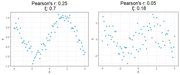
For a first look at the possible benefits of using this new formula, let us compare the calculated correlation values of a few simulated examples that highlight the key differences between each correlation method.
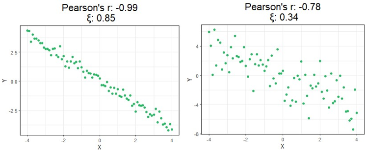
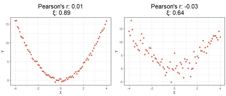
Starting at the top, we can see correlations using this new method no longer tell you the direction of the relationship since values can no longer be negative. As expected, however, this value is closer to 1 as the relationship strengthens and closer to 0 the more it weakens just like the aforementioned methods.
Moving on down is where things get exciting. It should be clear from the bottom four charts that this new approach is much more useful than traditional calculations at identifying significant relationships in general. Cases like these shown above are exactly the main motivation behind the research that led to this new formula since the second example shows Pearson’s
Up to this point, we’ve only looked at simulated data. Let us now go over some visual results using this new correlation method with a real-world example. Suppose we want to measure the level of independence between brain signals and time.
The following data is a recording of brain activity measured in the form of BOLD signals using functional magnetic resonance imaging (fMRI) made available through the popular R package astsa. To provide more context, this dataset contains the average response observable in eight various brain locations in the cortex, thalamus, and cerebellum across five subjects. Each subject was exposed to periodic brushing of the hand for 32 seconds and then paused for 32 seconds resulting in a signal period of 64 seconds. Data was then recorded every 2 seconds for 256 seconds total (n = 128).
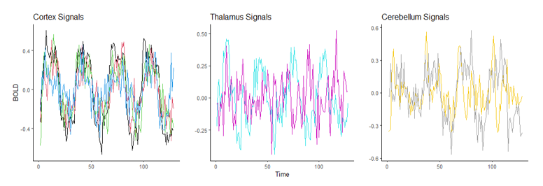
Suppose we wish to measure which of these three parts of the brain is most likely a function of time implying they are most involved when performing the prescribed stimulation. From the visual above, it appears that the Cortex signals are the least noisy, and one of the Thalamus’ signals are the noisiest, but let us quantify this using our new correlation statistic. The following table shows the correlation value of each of the eight measurements using the popular Pearson’s
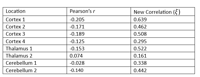
The table above reveals the common method for correlation consistently shows each of these relationships to be negative or approximately zero implying there is little to no observable relationship, and if there is one it exhibits a downward trend. This is clearly not the case since some of these wavelengths exhibit visibly strong relationships with time, and all of them appear to have no trend.
Furthermore, the new correlation values do a much better job identifying which location is least noisy, which is the main point of this analysis. The results show that parts of the Cortex are most notably being used during the period of stimulation since those correlation values are the highest on average, but there are also parts of the Thalamus that appear involved as well, a result not so easily detectable using the standard approach.
Conclusion
There is more that can be done to continue the analysis we started, such as perform an official hypothesis test of independence using the asymptotic theory presented earlier, but the purpose of this report was to simply introduce the new measure and showcase how simple these computations can be and how these results can be used. If you are interested in learning more about the pros and cons of this approach, I would encourage you to read the official publication introducing the method found in the references below.
This new approach is far from perfect, but it was created as a means of solving some of the most notable issues with the currently accepted approach. Since discovering it, I have been using it for my own personal research and it has proven very helpful.
Unless otherwise noted, all images, plots, and tables are by the author.
[1] S. Chatterjee, A New Coefficient of Correlation (2020), Journal of the American Statistical Association.
[2] E. Heuvel and Z. Zhan, Myths About Linear and Monotonic Associations (2022), The American Statistician.